PHOTOGRAPHY - A MOMENT IN TIME
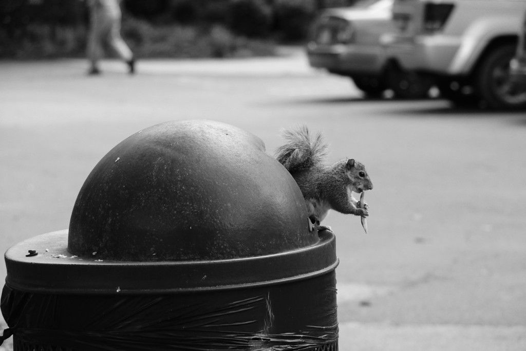
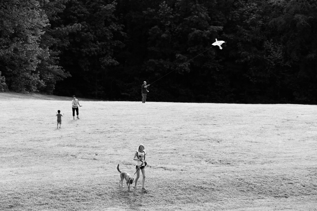
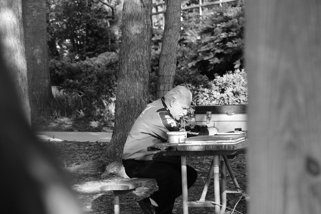
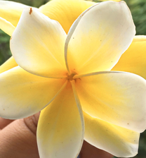
I picked these 3 photos to show how people are still enjoying the outside during this time. some are doing hobbies like painting and animals like this squirrel is enjoying its time eating a French fry.
|
|
|
|
|
|
|
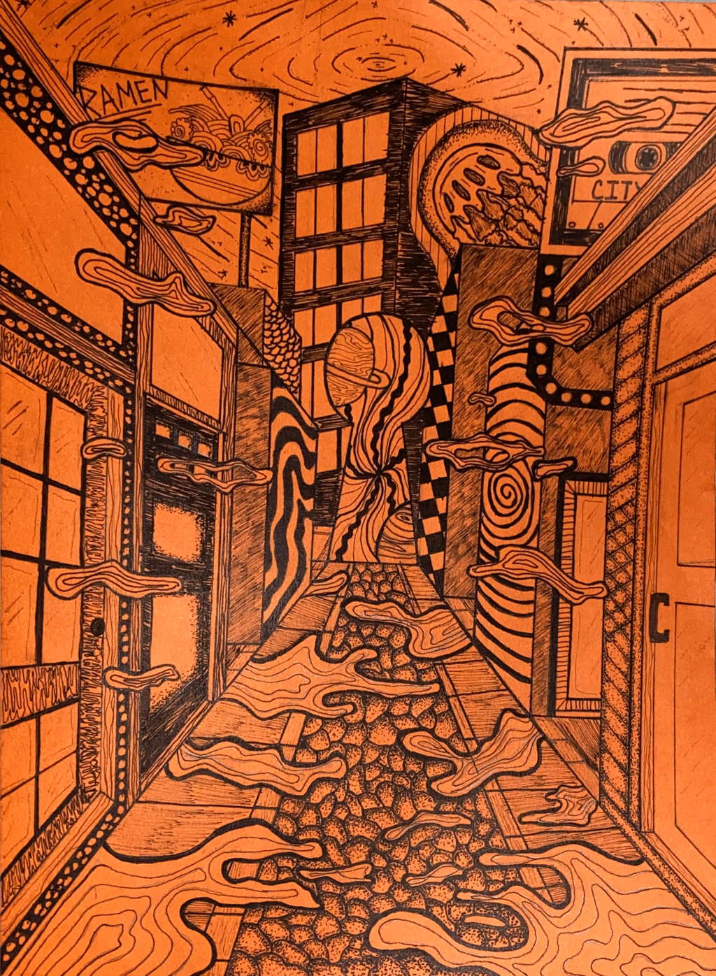
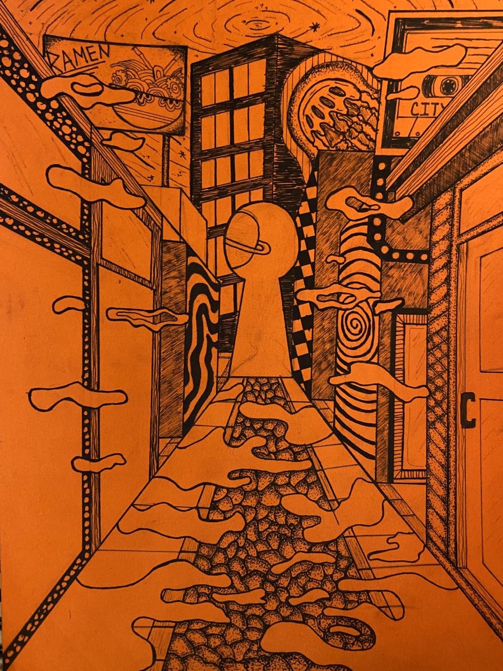
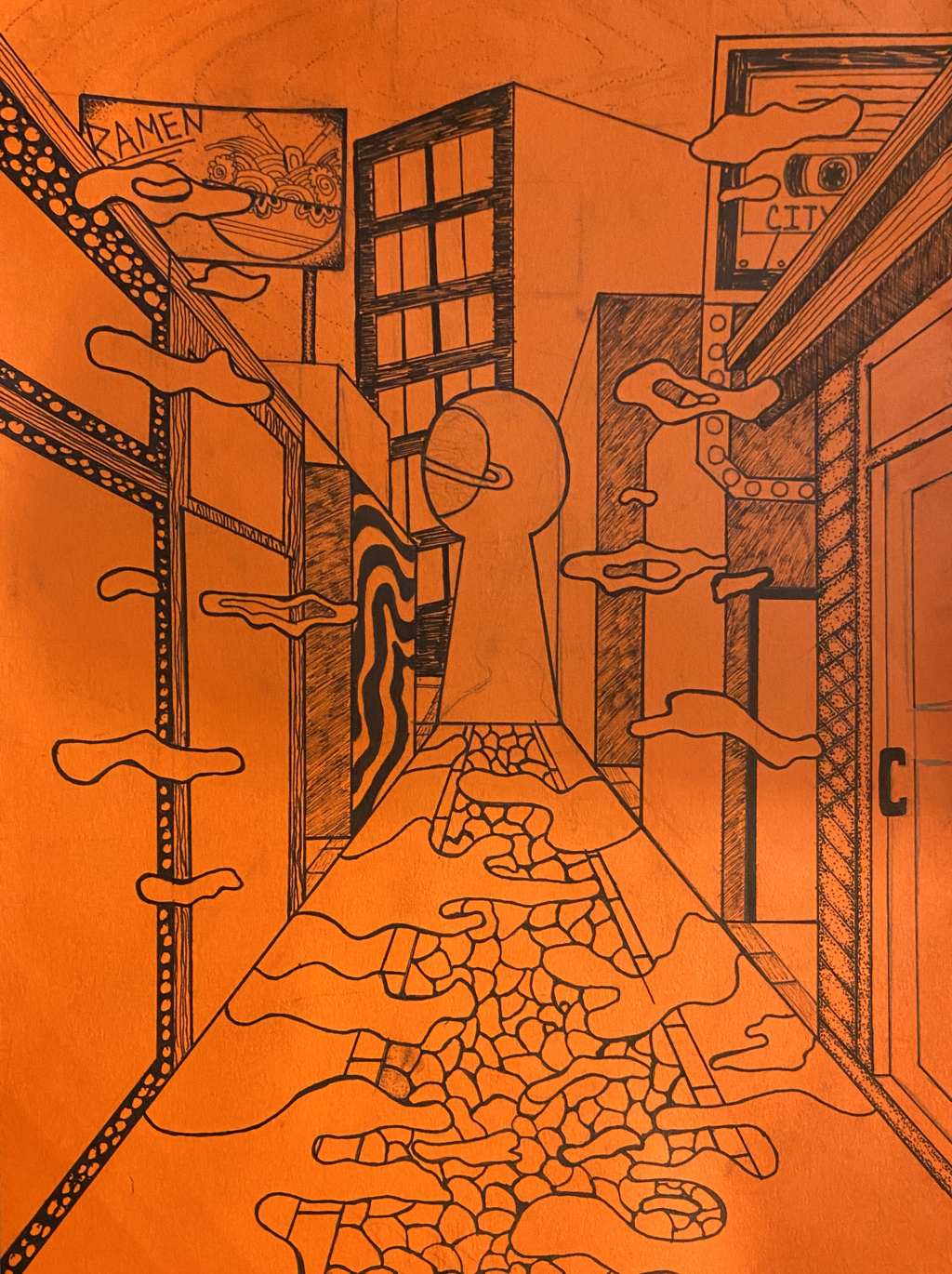
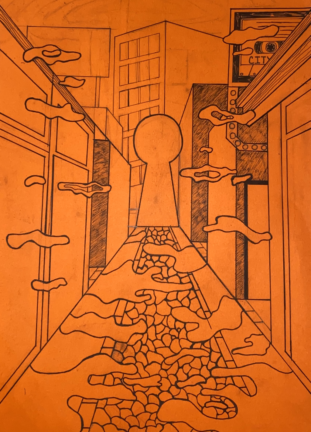
Pen and Ink Fantasy environment
|
3
|
2
|
1
|
|
|
|
|
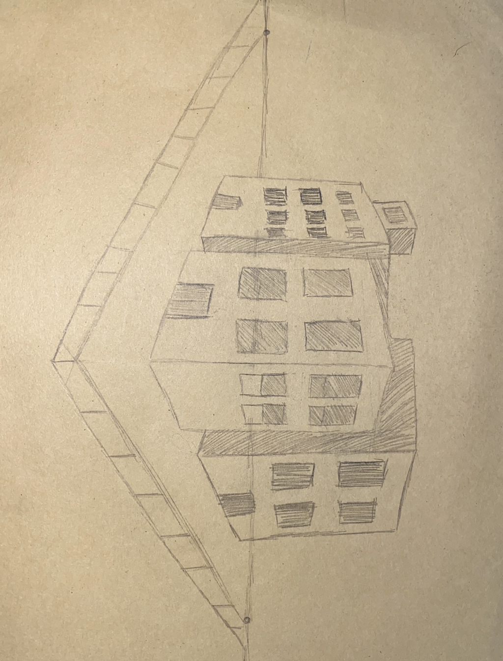
1. I choose to use more than one technique because I feel it looks a lot better and I would have been tired of doing just one technique. For some of the places I use stippling for, I just used that technique because I thought it would look good and for the pathway I was planning to using the stippling technique for the rocks to make it more real. I did some hatching and cross hatching for my project but I really mostly drew a bunch of lines because I didn’t want everything to be the same so I added other technique to it.
2. I used 1 point perspective to make the pathway go into the key hole portal.
3.Texture is important in my composition because it shows the shadows of the buildings, the ground and everything else.
4. Value is important in the way that it makes everything in the peace more real and describes the scene with different lights and darks.
5. This project I spent so much time on because I didn't know what I wanted to do for it and how I wanted it to be but I turned out a lot better than I thought it would have.
6 If I could recreate my piece I would definitely make sure that my lines are nice and clean and make the perspective a lot better because the lines were not good and it threw off the whole peace.
8. It is important because when you are applying the ink you need to know how to use it to make shadows and to show value to the peace and take your time to know where you want to put the techniques because if you mess up its hard to undo that mistake.
9. When I first learned pen and ink it was probably the most difficult for me to learn because I didn't understand it for some reason and now the I've taken art 2 and have a second chance at it I've gotten a lot better at it. For future projects ill understand more on where to add the lights and darks.
|
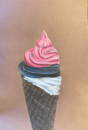
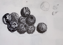
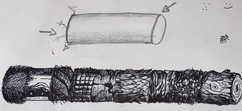
I used five different types of shading with pen from the left to right, going dark to light. the textures and patterns are important to show how to make each drawings looks with different pattens. Practice helps with pen and ink because you want make everything look nice with the different values. Understanding helps you know how you should use the values. These will help to know where to put the shadows.
I would focus a little bit more on where I should put the values. |
|
|
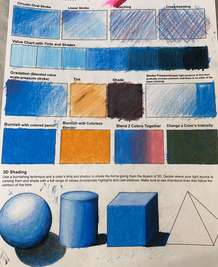
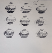
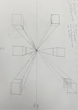
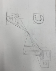
Using different perspectives to show how you can make a picture 3-D. I would change the way I have drawn some the lines to show more of its realness. Drawing more perspective picture will help me get better at drawing perspective. It would with knowing where to draw each line and how long each line is suppose to look.
|
|
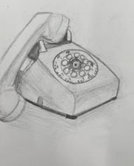
Using the different perspective to show how you can make shapes look 3-dimensional. using other perspectives to make different objects.
|
|
|
|
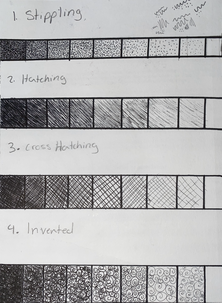
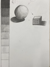
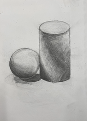
I used the value shading to show to values on to the shadow how you can make a sphere and cube look more like a picture then just drawings. blending out the pencil from dark to light. showing how realistic each object is.I would change how the I shaded some of the shapes to light and some not or too much shading
|
|
|
|
|
|
